Component Section
Add
Add a new component to a component section.
General usage
Usage:
import { ui } from '@shopware-ag/meteor-admin-sdk';

ui.componentSection.add({
    component: 'the-component', // Choose the component which you want to render at the component section
    positionId: 'the-position-id-of-the-component-section', // Select the positionId where you want to render the component
    props: {
        ... // The properties are depending on the component
    }
})
Parameters
| Name | Required | Default | Description |
|---|---|---|---|
component | true | Choose the component which you want to render. |
Return value:
This method does not have a return value.
Available components
Card
Properties:
| Name | Required | Default | Description |
|---|---|---|---|
title | false | The main title of the card | |
subtitle | false | The subtitle of the card | |
locationId | true | The locationId for the custom view | |
tabs | false | Render different content with tabs |
Usage:
import { ui } from '@shopware-ag/meteor-admin-sdk';

ui.componentSection.add({
    component: 'card',
    positionId: 'sw-product-properties__before',
    props: {
        title: 'Hello from plugin',
        subtitle: 'I am before the properties card',
        locationId: 'my-awesome-app-card-before'
    }
})
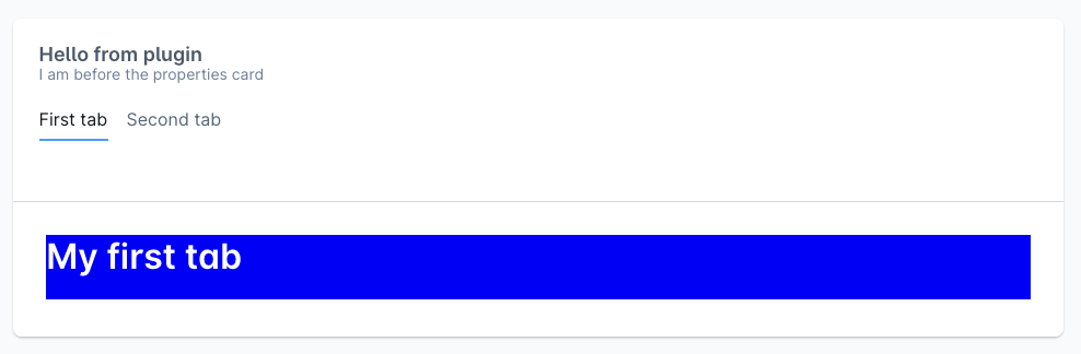
Example

With tabs:
import { ui } from '@shopware-ag/meteor-admin-sdk';

ui.componentSection.add({
    component: 'card',
    positionId: 'sw-product-properties__before',
    props: {
        title: 'Hello from plugin',
        subtitle: 'I am before the properties card',
        locationId: 'my-awesome-app-card-before',
        // Render tabs and custom tab content with the provided location id
        tabs: [
            {
                name: 'example-tab-1',
                label: 'First tab',
                locationId: 'example-tab-1'
            },
            {
                name: 'example-tab',
                label: 'Second tab',
                locationId: 'example-tab-2'
            }
        ],
    }
})
Example